Nookish goodness arrived at my house today! Therefore, as promised, here’s my overall initial review post.
First and foremost, y’all may have heard that the Nook comes with insanely complicated packaging. This is absolutely true. When you first get into it, there’s a little slip of paper that has–I kid you not–a seven-step procedure for freeing it from the various layers of packaging around it. This all had the advantage, I suppose, of making damn sure that it got to me intact. But when you have to have special instructions for actually unpacking the thing, I think they might have gone just a touch overboard, y’know?
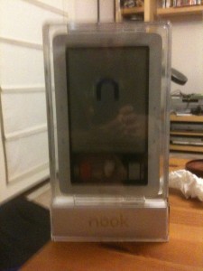
My reaction on getting it out of the first layer or so though was “It’s a Microsoft Ship-It award!” Because it looked like this, you see:
I had to get ‘s help to actually liberate the thing; he’d already done the same with his own nook, and his hands are stronger than mine, so he was able to do the last couple of steps to pry the thing out of its plastic support tray. Once that was done, I was able to do the fun part: powering it up, getting its updates on it, and most importantly, firing up the books.
Overall I like the design and look of it. Once I put it in its cover, it’ll be about the size of a small hardback book, and not so heavy that it’ll be onerous to carry in my backpack. I’m not much of a fan of the way the screen flashes when you turn a page, but other than that, I find the e-ink very readable, at least in direct light. It’s not as useful in low-light conditions, so this may be an issue when reading on the bus after dark. I may have to resort to the iPhone as backup reading device then. I am also amused that its default screensaver is the various pictures of authors that anybody who’s ever been in a B&N store will remember as being the artwork on the walls. I like that enough that I’ll probably keep it, for now.
It downloaded updates on its own, which was nice, and it cheerfully went and got all of the ebooks I’ve already purchased from the Barnes and Noble ebook store. This was I admit a trifle confusing UI-wise, since I’d set some of my books as “archived” because I’d already read them, and got confused because I had to tell the thing to go ahead and download those–but I didn’t have to do that with the rest of them. But it was all good in the end.
Getting all my non-B&N content onto it was super easy. You can plug it into a USB port and have it mount as a drive, which is lovely. You can then dump as many files as you like in whatever directory structure you like onto it, which is also lovely. But there are several organizational issues with how the device actually shows you the files, to wit:
- Whatever directory structure you use is entirely irrelevant, because the actual device will just do a flat display of all the files it finds; it doesn’t care about your folder structure.
- There is currently no way to organize your titles past “sort by author” or “sort by title”, in the “My Documents” section; in the “My Library” section, where the B&N content resides, it’s a little nicer and you also get “Most Recent” as a sort option. But what I would really want to see here is the ability to mark a book as Read somehow, whether that be by a tag or by moving it into a Read folder or what.
- After looking at the lovely lists of titles and cover thumbnails in the iPhone’s various reader apps, the black and white file list is really kind of boring to look at. But this is only a mild objection on my part since the tiny cover thumbnails would lose something on this display and not really be worth displaying.
- A lot of my PDF files are coming through with really weird mangled names. I don’t know why that is, if it’s a metadata problem on them or what. I may have to see if I can fix those in Calibre or something.
Tomorrow I’ll give it a good test run with actual reading, and report back on that. So far at least I’m favorably inclined to it, but man, I hope they improve the organization of files on the device in future firmware releases.
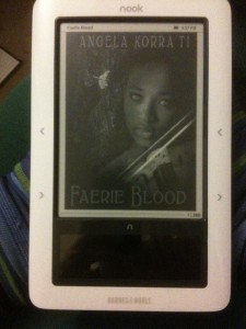
And oh yes, I also had to take a picture of this, because Kendis says hi:


Comments
4 responses to “And now, the Nook report!”
Cool beans!
Don’t the covers show up in the bottom bar there like they do in the promo pics?
They do, if you tell it to show them to you! It’s just that in that picture, the botton screen had gone dark. It does that if you don’t do anything with it in the specified timeout interval (whatever you happen to set that to).
Oh, now that’s coooooooool!!! 🙂 I *loved* that color display thingy right off the bat when I first saw pics at B&N. (I’m a cover-art whore and black & white doesn’t do it for me, lol.)
*sings* If I were a rich (wo)man…
I found out today though that the nifty covers only show up for your content that you buy off the B&N store–they don’t show up at all for the non-B&N content, like all the books I bought off of Fictionwise. Bah. 🙂 Oh well, maybe they’ll refine that in later releases of the software. I can hope!